3 Branding Mistakes You Can Avoid Using Logome.ai
Discover 3 branding mistakes to avoid using an AI logo maker. Learn dropshipping branding tips with Logome.ai to build a consistent, trusted brand identity.
.avif)

Building a brand today is more than just creating a logo—it’s about making the right first impression. In a crowded market, one wrong choice can make your business look forgettable, even if your product is great. Customers often decide within seconds whether your brand feels trustworthy or not.
That’s where using an AI logo maker along with dropshipping branding tips can make a real difference. Instead of wasting time or money on trial and error, you can design with purpose and consistency from the start. The right approach helps you avoid the common pitfalls that turn promising ideas into forgettable brands.
In this article, we’ll look at three branding mistakes that cost businesses the most. More importantly, you’ll see how to sidestep them using Logome.ai to create a unique, consistent, and professional identity that actually builds recognition and trust.
Branding Mistake #1 — Generic, Lookalike Logos (And How Logome.ai Keeps You Unique)
It’s tempting to grab the first logo that looks “good enough” and move on. But in reality, a generic logo is one of the fastest ways to lose trust. Customers are quick to notice when your brand feels like a copy-and-paste job, and they rarely forgive it. This is where Logome.ai helps you stand out.
Why Generic Logos Kill Recognition
A logo isn’t just decoration—it’s your business’s signature. When your design looks like hundreds of others in your niche, people forget you as quickly as they find you. Instead of sparking curiosity, you blend into the noise, making it harder to build loyalty or charge premium prices.
Using Logome.ai To Generate Distinctive Designs
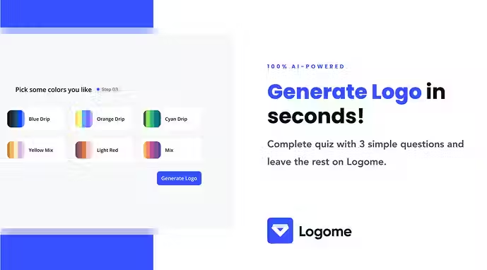
Start With A Tight Brief
The difference between a unique logo and a forgettable one starts with your brief. Inside Logome.ai, enter clear details about your audience, values, and tone. Avoid vague prompts—be specific about the emotions you want your brand to inspire and the clichés you want to stay away from.
Explore Multiple Design Directions
Never settle on the first output. Generate at least three or four distinct logo concepts that go beyond color variations. Think in terms of shapes, fonts, and design styles. This not only gives you options but also ensures your brand has room to evolve without being boxed in.
Run A Quick Uniqueness Scan
Once you’ve got a few strong options, place them next to competitors’ logos in your niche. You’ll quickly see which designs feel fresh and which risk being overlooked. This simple side-by-side check prevents you from investing in a design that unintentionally mirrors another brand.
Test For Scalability And Versatility
A great logo works everywhere—from a favicon to a billboard. Export your Logome.ai designs in different formats, test them at small sizes, and try them in black and white. If your logo loses impact when scaled down or stripped of color, it’s not ready for real-world use.
Branding Mistake #2 — Inconsistent Brand Roll-Out Across Channels (Fix It With A Logome.ai Brand Kit)
Having a great logo is only half the job. The real test of branding is how consistently you show up across every touchpoint—your website, social media, packaging, and even emails. Inconsistency confuses customers, weakens trust, and makes your brand forgettable. This is where a brand kit built with Logome.ai becomes essential.
Consistency Is A Growth Lever, Not A “Nice To Have”
When people see your brand looking different on every platform, they subconsciously lose confidence. A mismatched logo, changing colors, or random fonts tell customers you’re not fully professional. But when everything feels aligned, recognition builds faster, and trust follows naturally. Consistency is more than looks—it’s a growth driver.
Building A Cohesive Brand Kit In Logome.ai
Define Core Visual Elements
Start by locking in your essentials: logo spacing, color palettes, and typography hierarchy. Logome.ai lets you generate a brand guidelines document that acts as your rulebook. This ensures that anyone creating content for your business follows the same playbook.
Extend To Channel-Specific Assets
Your logo alone won’t cut it. Export social media templates, favicon variations, and email headers. If you run a Shopify or Amazon store, prepare product image frames that reinforce your identity. Having these assets ready makes it easy to maintain consistency at scale.
Bundle It All Into A Brand Guidelines PDF
A single PDF containing logo rules, colors, fonts, and templates saves endless headaches later. Instead of re-explaining your design choices, you can simply share this file with your team, freelancers, or partners. It becomes the one source of truth for your brand.
A Roll-Out Checklist For Every Channel
Consistency requires discipline. Use this checklist to avoid gaps:
- Website: Logo placement, favicon, alt text, and clear branding across all pages.
- Email: Branded signatures, headers, and footers for campaigns and automation.
- Social Media: Profile photos, covers, and story highlight icons that match your kit.
- Marketplaces: Product frames and listing images tailored for Shopify or Amazon.
- Print: Packaging inserts, thank-you cards, and shipping labels aligned with your design.
Governance To Prevent Brand Drift
Consistency isn’t just about design—it’s about control. Store all brand assets in a shared location, keep a versioning system, and appoint someone to approve design updates. Running quarterly audits also ensures nothing drifts over time. A small habit like this keeps your brand sharp long-term.
Branding Mistake #3 — Skipping Accessibility, Contrast, And Real-World Testing
Many brands stop at creating a logo and brand kit but never check how it performs in real-world conditions. Ignoring accessibility or skipping tests across devices and print can make your brand look unprofessional and even frustrate potential customers. Good design isn’t just about looks—it’s about usability and inclusivity.
Accessibility Impacts Brand Performance
When colors don’t contrast properly, text becomes hard to read, and buttons disappear into backgrounds. This makes your brand feel sloppy and alienates users with visual impairments. Accessibility isn’t just compliance—it directly impacts trust and conversions. If customers can’t comfortably engage with your brand, they won’t stick around.
Practical WCAG Contrast Checks For Logos And Assets
Test Text And Background Ratios
Use a contrast checker to make sure body text meets WCAG 2.2 standards: 4.5:1 for normal text and 3:1 for large text. Apply these rules to CTAs, overlays, and image captions. If your content isn’t legible, your design is failing its purpose.
Define Light And Dark Variations
Don’t rely on one version of your assets. Create both light and dark backgrounds so your brand looks sharp in every mode. Whether your site is viewed in dark mode or on a white printout, your identity should remain clear and recognizable.
Device, Mode, And Print QA
Your logo and colors may look perfect on a modern laptop, but what about a cheap phone in dark mode? Test across devices, screen resolutions, and environments. Print your designs in grayscale or on matte paper to see if they still hold up. Real-world usage reveals flaws software previews hide.
Analytics And Feedback Loops
Brand testing doesn’t end with visuals. Measure performance by tracking bounce rates, click-throughs, and add-to-cart activity after updating brand assets. Pair this with quick surveys asking if pages feel easy to read. Data plus feedback ensures your design isn’t just pretty—it’s effective.
Dropshipping Branding That Converts: From Listing Frames To Inserts
Dropshipping businesses face a unique challenge—most sellers are offering the exact same products. In this crowded space, branding becomes your only real differentiator. The way your store looks, communicates, and delivers trust signals can decide whether customers choose you or the competitor selling at the same price.
The Parity Problem And The Brand Solution
When products are identical, the deciding factor is trust. Shoppers often pick the store that feels more professional, reliable, and memorable. A consistent visual identity across your site, social media, and packaging makes customers believe they’re buying from a real brand, not just another generic store.
Building An Asset System In Logome.ai
Listing Image Frames And Icons
Create product frames, size charts, and return/warranty icons that carry your brand colors and typography. Even on marketplaces like Amazon or Shopify, this small layer of consistency makes your listings stand out and look trustworthy.
Branded Packaging Inserts
Don’t just ship a plain box. Use Logome.ai to design thank-you cards, product care guides, or discount inserts that reinforce your brand identity. These little touches improve customer loyalty and increase repeat purchases.
Transactional Email Templates
Most dropshipping stores ignore transactional emails, but they’re part of your brand too. Design headers and signatures inside your brand kit so every confirmation, shipping update, and delivery email feels like it came from the same professional source.
Marketplace Guardrails For Consistency
Your identity doesn’t stop at your website. Ensure thumbnails are legible at small sizes, keep product images aligned with safe zones, and use consistent backgrounds. Adding review badges, trust icons, and social proof in a branded template can also tip purchase decisions in your favor.
60-Minute Logome.ai Setup: Brief → Generate → Validate → Roll Out
Creating a brand doesn’t need to drag on for weeks. With the right process, you can design, refine, and launch your visual identity in under an hour. Logome.ai makes this possible by guiding you through a focused workflow that eliminates guesswork and wasted time.
The Hour Plan (Step-By-Step)
0–10 Minutes: Prep And Sanity Checks
Start by finalizing your brand name and running quick trademark, domain, and social handle checks. Write down a one-line positioning statement about your audience and value. This clarity ensures Logome.ai has the right context for your designs.
10–25 Minutes: Generate Concepts
Enter your brief into Logome.ai and generate three to four distinct logo directions. Explore variety—think different shapes, layouts, and typography styles. Don’t stop at color variations; aim for designs that feel truly different from one another.
25–35 Minutes: Run A Uniqueness Scan
Compare your top designs against competitor logos. Place them side by side in a quick collage. Eliminate anything that feels too similar or generic. Keep one or two directions that stand out visually and align with your positioning.
35–45 Minutes: Build A Brand Kit
Lock in your color palette, typography hierarchy, and template set. Export brand guidelines that include logo usage rules, favicon versions, and social media templates. This kit becomes the foundation for consistent roll-outs.
45–55 Minutes: Test Accessibility And Scalability
Check contrast ratios to meet accessibility standards. Test your logo in small sizes, in black and white, and across light and dark backgrounds. If it holds up, it’s ready for real-world use.
55–60 Minutes: Publish And Apply
Upload your new assets to your website header, update your email signature, and refresh your social profiles. With this setup, your brand is live, consistent, and ready to build recognition across every touchpoint.
Templates, Checklists & Scorecards (Copy, Paste, Use)
Consistency in branding isn’t just about creativity—it’s about process. Having ready-to-use templates and checklists saves time, reduces errors, and ensures your brand always looks polished. Here are simple tools you can adapt immediately for your business.
Brand Brief Template
A clear brief avoids vague outputs and helps Logome.ai generate logos that match your vision. Use this format before creating any designs:
- Audience: Who are you trying to reach?
- Values: What does your brand stand for?
- Tone: Professional, playful, bold, or minimalist?
- Usage: Website, packaging, social, marketplace, etc.
- Avoid List: Colors, shapes, or clichés you don’t want.
Consistency Audit Checklist
Run this checklist once every quarter to keep your identity aligned:
- Logo spacing and placement rules followed
- Correct color codes used everywhere
- Fonts applied consistently across platforms
- Calls-to-action readable with proper contrast
- Favicon uploaded and visible on site
- Branded email headers and signatures in use
- Social media profiles aligned with kit
- Marketplace product frames applied
- Packaging inserts branded properly
- Brand guidelines PDF updated and shared
Pre-Launch QA Scorecard
Before you roll out your brand, test with this quick scorecard:
- Trademark, domain, and social handles checked
- Logos tested in small sizes and grayscale
- Contrast ratios meet accessibility standards
- Brand kit exported and saved centrally
- Competitor comparison completed for uniqueness
- Analytics baseline documented for later tracking
These templates don’t just save time—they help you avoid costly rework and keep your brand trustworthy in the eyes of your customers.
Conclusion — Fewer Choices, Better Checks, Faster Launch
Branding doesn’t fall apart because of one big mistake—it’s usually the small things that add up: a generic logo, inconsistent roll-outs, or assets that fail accessibility checks. Each one chips away at trust and makes your business feel less credible than it really is.
With Logome.ai, you can avoid those pitfalls and build a brand that feels polished from the start. By following a clear process—briefing smartly, testing designs, rolling out consistently, and keeping accessibility in check—you create an identity that stands out and builds confidence across every touchpoint.
The best part? This isn’t about spending months perfecting tiny details. With the right workflow and tools, you can launch a brand that looks professional, feels consistent, and grows recognition—all in less time than your competitors think possible.
Start your dropshipping business today
FAQs About 3 Branding Mistakes You Can Avoid Using Logome.ai
What makes a logo appear generic?
A logo becomes generic when it uses overused icons, basic shapes, or design clichés without unique tweaks. Lack of originality makes it harder for customers to distinguish your brand.
Can AI-generated logos be trademarked?
Potentially yes—but not always. Whether you can trademark a logo depends on its uniqueness and local trademark rules. Always check before full launch.
How many design variations should I generate?
Generate at least 3 to 4 distinct logo directions—vary shapes, fonts, or layout, not just colors. That gives you room to test what feels most unique and fitting.
Why is accessibility important for branding?
Accessible colors and contrasts make your brand readable for more people. It also builds trust and ensures your brand isn’t excluding anyone.
How do I keep branding consistent across platforms?
Use a central brand kit or guidelines document that defines colors, fonts, spacing rules, and template assets. Always refer to it when creating new assets.


Launch your dropshipping business now!
Start free trial


Related blogs

How to Open a Business Bank Account for Your Dropshipping Store
Set up your dropshipping finances the right way with a dedicated business bank account built for payouts, supplier payments, taxes, and long-term store growth.

Spocket vs Dropified: Which Tool Is Better for Multi-Store Scaling?
Compare Spocket and Dropified for multi-store dropshipping, supplier quality, automation, fulfillment, product sourcing, and scaling across ecommerce platforms.

Social Commerce in 2026: How Dropshippers Are Selling Directly Inside Social Apps
See how dropshippers are using TikTok Shop, Instagram, Facebook, Pinterest, creators, and shoppable content to sell products inside social apps.