Best Landing Page Examples in 2025 for Maximum Conversions
Discover the best landing page examples in 2025. Learn what makes them effective, including design tips, case studies, and statistics to drive higher conversions.

.avif)

Landing pages are one of the most critical components of any digital marketing strategy. They are designed with a singular purpose: converting visitors into leads, customers, or subscribers. But with the ever-evolving digital landscape, what makes a landing page truly effective in 2025? In this article, we will explore some of the top landing page examples, breaking down their elements to help you build high-converting landing pages for your business.
In today’s world, creating a landing page isn’t just about pretty pictures and catchy headlines. It’s about using strategy, user behavior insights, and data-driven design to optimize for conversions. Let’s dive into seven of the best landing page examples in 2025 that are winning hearts and driving results.
Top 7 Landing Page Examples in 2025
Creating a successful landing page is an art. The best landing pages don’t just look good; they convert visitors into leads, customers, or subscribers. The examples we’ve covered in this article highlight the essential elements of a high-converting landing page: compelling visuals, clear messaging, trust signals, and a seamless user experience.
As we move through 2025, these design principles will continue to drive results. Whether you’re building a page for your business or improving your current one, these examples can inspire you to craft landing pages that engage, inform, and convert.
1. Wix – Interactive Scrolling Experience

Wix is a platform that thrives on offering visually stunning websites, and its landing page is no exception. Wix’s landing page features a dynamic scrolling effect that introduces the product with an interactive visual experience. Visitors are guided through the features of Wix by smooth animations, making the page visually engaging and easy to follow.
Why It Works
- Immersive Experience: The scrolling effect not only grabs attention but also guides users naturally through the content.
- Visual Appeal: It combines vibrant visuals and a clean layout, making it eye-catching without overwhelming the visitor.
- Call-to-Action (CTA): The CTA is strategically placed, making it easy for users to take action without feeling intrusive.
How This Example Helps
According to HubSpot, interactive landing pages can increase user engagement by up to 80%. Wix’s dynamic scrolling not only helps in creating an engaging experience but also ensures users remain on the page longer, which boosts conversion rates.
2. ExpressVPN – Trust and Simplicity
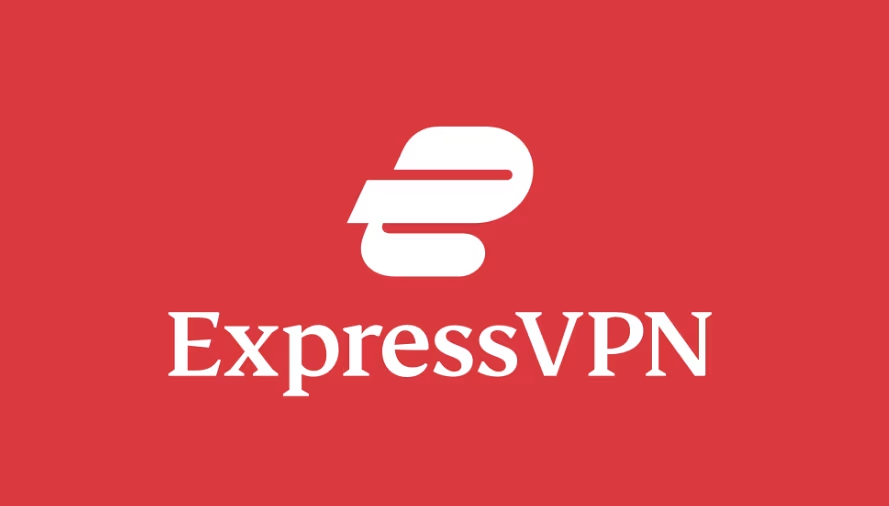
When it comes to trust and security, ExpressVPN nails it with its clean and straightforward design. Their landing page is focused on clarity, making it evident why someone would need a VPN. The use of clear messaging, trust indicators (such as app store reviews and TrustPilot ratings), and simple visuals help establish confidence in potential customers.
Why It Works
- Simplicity: The design focuses on delivering the message clearly, with minimal distractions.
- Trust Signals: By displaying user reviews, ExpressVPN builds credibility and makes the service feel trustworthy.
- Focus on Benefits: The page highlights the top features and benefits of the VPN service, making it easy for users to understand why they should sign up.
How This Example Helps
92% of consumers trust recommendations from others, and ExpressVPN incorporates this by showcasing social proof through user reviews, which enhances trust and increases conversion rates.
3. LinkedIn Ads – Sticky, Non-Disruptive CTA

LinkedIn Ads has one of the most effective landing pages for its business solutions. The key feature of the landing page is its sticky CTA, a floating button that remains visible as visitors scroll through the page. This design keeps the CTA accessible without being intrusive, allowing users to continue exploring before taking action.
Why It Works
- Sticky CTA: By keeping the CTA visible at all times, LinkedIn ensures users are always reminded of the action they can take.
- Non-Intrusive: The CTA doesn’t disrupt the user’s experience, which creates a seamless flow on the page.
- Content Balance: LinkedIn provides ample content about its service before encouraging visitors to convert.
How This Example Helps
According to Neil Patel, landing pages with a single CTA perform 220% better than those with multiple CTAs. LinkedIn’s use of a sticky CTA ensures that users are never far from the action, which increases the likelihood of conversion.
4. Blue Apron – Clear Value Proposition

When you land on Blue Apron’s landing page, the first thing you notice is the clear value proposition. The page is concise and to the point, focusing on the ease and convenience of meal kit delivery.
Why It Works
- Value Proposition Clarity: Blue Apron emphasizes what sets it apart in just a few words: "Delicious meals, delivered weekly."
- Minimalistic Design: The page uses white space effectively to focus on the CTA without distractions.
- Targeted Messaging: The text is perfectly aligned with the target audience's needs, making it more relatable.
How This Example Helps
Studies show that 38% of visitors will stop engaging with a website if the content or layout is unattractive . Blue Apron avoids this by using a clean, appealing design that enhances user experience and encourages sign-ups.
5. Uber for Business – Focused Messaging
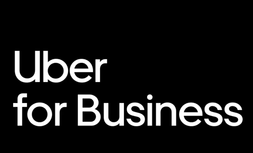
Uber's landing page for its business solutions has a unique strength – its focused messaging. Unlike other landing pages that may bombard visitors with numerous options, Uber keeps the page laser-focused on one message: how Uber for Business can streamline transportation for companies.
Why It Works
- Concise Messaging: The page clearly explains the service, showcasing its benefits for business owners.
- Brand Trust: By showcasing the Uber brand, the landing page benefits from the company’s established trustworthiness.
- Simple Navigation: The CTA is clear, and users know exactly what to do next.
How This Example Helps
The key to a successful landing page is clarity. According to Nielsen, simplicity helps users feel confident in their decisions. Uber's straightforward design encourages users to trust the brand and take action.
6. Skillshare – Engaging Visuals and Testimonials

Skillshare makes use of engaging visuals and user testimonials on their landing page to connect with potential students. The visuals are accompanied by real user experiences, which makes the offering more relatable.
Why It Works
- Visual Engagement: High-quality images of students learning enhance the sense of community.
- Social Proof: User testimonials and success stories are prominently displayed, creating trust.
- Action-Oriented CTA: The CTA encourages users to join a class and start learning immediately.
How This Example Helps
Research by Neil Patel found that user-generated content (such as testimonials) has a 12% higher effectiveness rate compared to traditional content. Skillshare’s use of testimonials capitalizes on this psychology to encourage sign-ups.
7. MasterClass – High-Quality Visuals and Social Proof

MasterClass’s landing page is a masterpiece of high-quality visuals and social proof. Featuring some of the world’s most iconic instructors, such as Gordon Ramsay and Serena Williams, the page immediately grabs attention.
Why It Works
- Celebrity Instructors: Featuring big names boosts credibility and allure, making the courses feel more exclusive.
- High-Quality Visuals: Stunning images and videos help immerse visitors in the world of MasterClass.
- Testimonials & Reviews: User testimonials help highlight the value of the classes, providing further trust signals.
How This Example Helps
According to Nielsen, 85% of consumers trust online reviews as much as personal recommendations. MasterClass leverages this powerful form of social proof to convert more visitors into customers.
Landing Page Design Best Practices for 2025
In 2025, landing page design goes beyond just aesthetics; it’s about creating a seamless user journey that encourages visitors to take action. By focusing on clear headlines, strategic use of white space, compelling visuals, strong calls-to-action, and mobile optimization, you can ensure your landing page not only captures attention but also drives conversions.
These best practices will help you stay ahead in an increasingly competitive digital landscape, making your landing page a powerful tool for achieving your marketing goals.
1. Clear and Simple Headlines
Your headline is the first thing a visitor sees when they land on your page, so it needs to grab attention and clearly convey what the page is about. Think of it as the hook of a book — if it doesn't spark interest or clearly explain the benefit, visitors will quickly lose interest.
Why it’s important
- Clarity: A clear headline immediately tells visitors what value they can expect from the page. Ambiguity can lead to confusion and higher bounce rates.
- Engagement: A headline that resonates with your audience’s needs or pain points will encourage them to read further. For example, "Get Fit in Just 30 Minutes a Day" immediately communicates the value and benefit of your service.
Best Practice
- Be concise and specific.
- Use language that speaks to the visitor’s needs or desires.
- Avoid jargon — keep it simple and easy to understand.
2. Use of White Space
White space, also known as negative space, refers to the empty areas around text, images, and other design elements. It’s not just "empty" space but serves a vital role in enhancing the page’s design and user experience.
Why it’s important
- Improved Readability: Too much content crammed into a page makes it hard for visitors to digest the information. White space helps break up text and keeps the page looking clean.
- Focus: By giving content room to breathe, white space directs the visitor’s attention to the most important elements, like your call-to-action (CTA) or key messaging.
- Aesthetics: White space makes a page look modern, sophisticated, and organized, which can positively influence your brand's perception.
Best Practice
- Use white space to separate sections and guide the reader's journey.
- Ensure the text isn't too dense — give it space to stand out.
- Avoid cramming too many images or elements together. Let each element stand on its own.
3. Compelling Visuals
Images, videos, and other visuals are powerful storytelling tools that can quickly communicate your brand message, product benefits, or service value. In fact, studies show that people process visual information much faster than text, making visuals an essential part of a landing page.
Why it’s important
- Visual Appeal: High-quality images or videos can capture attention, creating a positive first impression and increasing engagement. Tools that unblur images can also enhance visual clarity, making your content more appealing and professional.
- Illustrate Benefits: A picture or video can convey more than words. For instance, a product image can showcase its design, features, and quality. Videos can show the product in action, giving visitors a clearer understanding.
- Evoking Emotion: Visuals can trigger emotions. For example, using happy customer photos or video testimonials can evoke trust and social proof, encouraging visitors to take action.
Best Practice
- Use high-quality, relevant visuals that support your message.
- Avoid overloading the page with too many images or distracting elements.
- Optimize visuals for fast loading speeds, as large files can slow down your page, impacting performance and user experience.
4. Strong Call-to-Action (CTA)
The call-to-action is arguably the most critical element of your landing page. It's the button, link, or prompt that guides visitors toward the desired action, whether it's making a purchase, signing up, or downloading something.
Why it’s important
- Direction: A strong CTA acts as a guide for the visitor, helping them understand what to do next. It ensures they don’t leave the page without taking the action you want them to.
- Urgency and Motivation: Well-crafted CTAs create a sense of urgency or provide a clear benefit, motivating visitors to act immediately. For instance, "Sign Up Today for 50% Off" creates an immediate reason to click.
- Conversion: The CTA is directly tied to conversions. If it’s easy to find and compelling, you’ll see higher conversion rates.
Best Practice
- Make your CTA stand out with bold colors that contrast with the background.
- Use action-oriented language that tells the visitor what to do (e.g., "Get Started," "Buy Now," "Claim Your Offer").
- Avoid using too many CTAs. Stick to one primary action to avoid confusion.
5. Mobile Optimization
With mobile internet usage continuing to rise, it’s no longer optional to have a mobile-friendly landing page. As of 2025, over 54% of all internet traffic comes from mobile devices. This means that if your landing page isn’t optimized for mobile, you’re likely losing more than half of your potential visitors.
Why it’s important
- Responsive Design: Mobile optimization ensures that your page looks and functions well across various devices (smartphones, tablets, desktops). A mobile-optimized page adjusts its layout and content based on the screen size, ensuring a seamless experience for all users.
- User Experience (UX): Mobile optimization isn’t just about resizing images or text. It's about making sure the content is easy to read and interact with on smaller screens. If the page isn’t mobile-friendly, users may struggle to navigate, causing them to leave.
- SEO: Google considers mobile-friendliness as a ranking factor. Pages that aren't optimized for mobile may rank lower, which affects your organic search performance.
Best Practice
- Use responsive design techniques to make sure your page adapts to any device.
- Optimize images and content to load quickly on mobile devices.
- Ensure buttons and forms are large enough to tap comfortably on mobile screens.
- Test your page on different devices to make sure everything functions as intended.
Conclusion: Crafting the Perfect Landing Page
The key takeaway from these seven best landing page examples is the importance of design, clarity, and trust. When crafting your own landing page, focus on what your customers care about most: a seamless user experience, clear value proposition, and a compelling reason to act.
By using these top landing page strategies and incorporating elements like strong CTAs, social proof, and engaging visuals, you can significantly improve your conversions in 2025 and beyond. Start implementing these design techniques today and watch your conversion rates soar!
Start your dropshipping business today
FAQs about Best Landing Pages
Why is a clear headline important for my landing page?
A clear and simple headline is essential because it immediately communicates the value of your landing page to visitors. It sets the tone for the entire page and helps users quickly understand what they can gain by staying. Without a strong headline, visitors may leave before exploring your content further.
How does white space impact my landing page’s performance?
White space improves readability, enhances the user experience, and keeps the page visually appealing. It helps guide the visitor’s attention to important elements like your call-to-action (CTA). By preventing clutter, white space makes the content more digestible, improving the overall effectiveness of your landing page.
What role do visuals play in landing page design?
Visuals, such as images and videos, play a crucial role in engaging visitors and conveying information faster than text. Well-chosen visuals can illustrate your product’s features, evoke emotions, and build trust, making your landing page more compelling and increasing conversions.
How do I create an effective call-to-action (CTA)?
To create an effective CTA, make sure it is action-oriented, stands out on the page, and is aligned with the visitor’s needs. Use simple, clear language like "Get Started" or "Sign Up Now." Position the CTA prominently and ensure it feels natural, without being too aggressive or overwhelming.
Why is mobile optimization crucial for landing pages in 2025?
With over half of internet traffic coming from mobile devices, mobile optimization ensures your landing page provides a smooth and user-friendly experience on smartphones and tablets. A mobile-responsive design increases engagement, reduces bounce rates, and improves your page’s SEO performance, ultimately driving more conversions.


Launch your dropshipping business now!
Start free trial


Related blogs
Top WordPress eCommerce Themes for 2026
Explore the best WordPress eCommerce themes for 2026. Compare WooCommerce themes by speed, design, features, and dropshipping potential.


Saba Mohebpour Didn't Stop at Spocket: His New $50M Fund, ILA Capital, Is Buying Up Shopify and Amazon Apps
After building Spocket into a major ecommerce platform, Saba Mohebpour is launching ILA Capital with a $50M strategy to acquire Shopify and Amazon apps powering modern ecommerce.

Top Trendsi Alternatives for Fashion Dropshipping
Explore the best Trendsi alternatives for fashion dropshipping, fast shipping, branding, Shopify integration, and reliable suppliers.