Logo Placement on Shirt: The Ultimate Guide for Custom Tees
Find the best logo placement on shirt with tips, size guides, printing methods, and common mistakes to avoid. Perfect your custom tees for any project!


You want your t-shirt to make an impression, and logo placement on shirt is a detail that can make or break your design. The right spot ensures your brand stands out, catches attention, and communicates exactly what you want—whether for a business, event, or personal style.
Great logo placement isn’t just about looks; it can affect comfort, visibility, and even how professional your shirts appear. Read on for insights, tips, and real-world advice for getting your logo placement just right.
Why Logo Placement on Shirt Matters?
Logo placement on shirt is much more than an afterthought. Where you put your logo affects how people see your brand and how comfortable the shirt feels to wear. A logo that’s too large or positioned awkwardly might draw the wrong kind of attention—or worse, make your shirt unwearable. People often underestimate how much placement influences both perception and function.
For businesses, the placement decision shapes brand identity and creates memorable impressions. Think about famous left-chest logos—like Polo Ralph Lauren or Lacoste—conveying a sense of tradition and class. Center chest logos, on the other hand, shout for attention and work for statement designs. The choice can even hint at your company’s vibe—classic, bold, fun, or modern.
Comfort and practicality matter too. Oversized prints in the middle of the chest might look good on a mockup, but they can feel stiff or cause sweat patches in reality. Smaller, more thoughtfully placed logos reduce these problems and keep the shirt wearable all day. Certain placements are more visible under jackets or in photos, which is important for teams or event apparel.
Your audience’s expectations play a role. Sports teams, schools, and clubs often choose full front or upper back placements for maximum visibility, while fashion brands lean on subtle chest or sleeve prints. Picking the right spot can reinforce your message and help your logo become recognizable wherever the shirt goes.
Different Logo Placement on Shirt Options
Here are the different ways you can try your logo placement on shirts and get them right:
Left Chest Placement
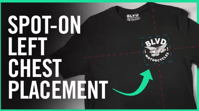
Left chest logo placement is a classic. Small, subtle, and right where you expect to see a badge, this spot is a favorite for brands who want to look timeless or professional. It’s the traditional home of the Polo pony and countless team and company logos. If you want to give off a preppy, understated, or corporate vibe, this is the way to go.
Typical logo size: 2.5 to 5 inches wide
Placement: Three to four inches below the collar, never past the armpit.
Best for: Simple graphics, symbols, or text that need to look clean and polished.
A left chest logo is visible even when wearing a jacket or carrying a bag, which is why so many uniforms and company shirts use it. You can choose this spot for its association with trust and tradition.
Center Chest Placement
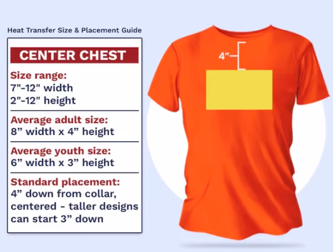
When you want everyone to see your logo the instant they look at your shirt, go for center chest placement. This puts your design front and center, making it perfect for statement logos, charity events, athletic gear, and merch drops.
Typical logo size: 6 to 10 inches wide
Placement: Three to five inches below the collar line, centered on the shirt’s width.
Best for: Designs that are bold, moderately detailed, or include text you want noticed from a distance.
Center chest placement is great for shirts that are meant to be seen in photos, at events, or on stage. You’ll often see this used for team names, slogans, and large company branding.
Full Chest/Full Front Placement
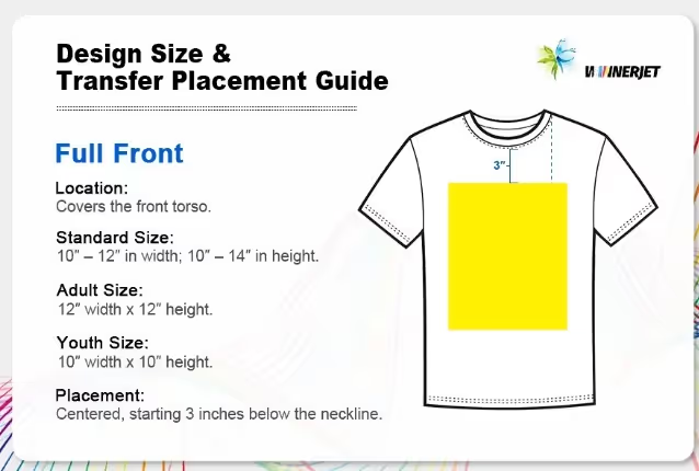
Full chest or full front placement is for big, bold designs that cover the majority of the shirt’s front. This spot offers tons of visibility and maximum impact.
Typical logo size: 10 to 12 inches wide, 10 to 14 inches tall
Placement: Starts three to four inches below the collar, centered, filling as much of the shirt as looks good without overwhelming it.
Best for: Large, detailed graphics, artwork, or logos that need to dominate the design.
Full front placements are popular for band tees, athletic jerseys, and shirts meant to serve as wearable art. Just remember—oversized prints can affect the shirt’s comfort and breathability, so adjust the design as needed.
Upper Back & Collar Placement
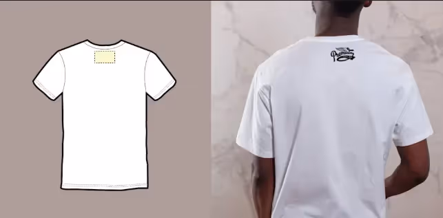
Upper back and collar logo placements add a subtle, unexpected detail. These spots are favorites for brands wanting a modern twist or an extra touch without distracting from the main design. You’ll spot upper back logos on athletic jerseys, team shirts, and custom apparel, especially where names or numbers usually go.
Typical logo size: 1 to 3 inches tall and wide for collar, 6 to 10 inches wide for upper back
Placement: Centered below the collar seam, just above the shoulder blades, or right on the collar itself
Best for: Secondary branding, small logos, web addresses, or motivational phrases
Logos here are easy to see from behind but don’t dominate the shirt’s front. They’re great for teams, events, or layered looks where the front remains minimal.
Full Back Placement
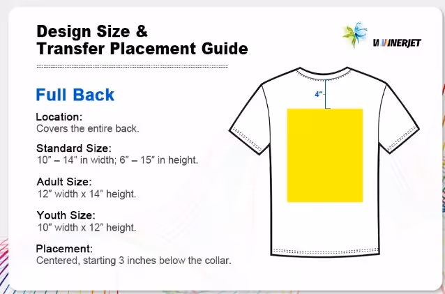
If you want your logo to be noticed from across a room, full back placement gets it done. This option is a staple for sports teams, staff shirts, and anyone looking to make a statement. Full back designs offer the most printing real estate, which is ideal for artwork, slogans, or large text.
Typical logo size: 12 to 14 inches wide, up to 16 inches tall
Placement: Centered on the back, usually three to four inches below the neckline
Best for: Big, detailed designs, event names, team rosters, or messages you want visible from a distance
You can pair a full back logo with a smaller left chest or sleeve print to balance your branding across the shirt.
Sleeve Placement
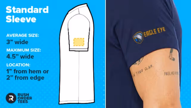
Sleeve logo placement is all about subtle branding. You’ll find logos on the upper arm—usually the left sleeve, but sometimes the right. This placement keeps your main design uncluttered and adds personality to team shirts, uniforms, or trendy casual wear.
Typical logo size: 1 to 4 inches wide
Placement: About half an inch above the sleeve hem or centered on the outside of the arm
Best for: Small logos, emblems, flags, or hashtags
Sleeve prints look great on both short- and long-sleeved shirts, especially when paired with another logo on the chest or back. If you want branding that’s visible but not overpowering, the sleeve is a go-to spot.
Pocket & Alternate Placements

If your shirt has a pocket, why not use it? Pocket placements work well for monograms, mini-logos, or cheeky graphics. They’re fun and add personality, especially for casual or event tees.
Typical logo size: 2 to 3 inches wide
Placement: Centered above or directly on the pocket
Best for: Monograms, brand initials, or symbols
Other alternate spots include the bottom hem or side of the shirt for subtle, stylish branding. You can also try the side seam or even the inside collar for a surprise detail only the wearer knows about.
How to Choose the Right Printing Method for Your Logo Placement on Shirt?
Here’s how:
Screen Printing
Screen printing is the gold standard for t-shirt logo placement on shirt—especially for bulk orders or simple, bold designs. This method uses a mesh screen to push ink through onto the fabric. The result is a vibrant, durable print that stands up to many washes. You’ll get the best results for solid colors and high-contrast logos.
Screen printing works well for left chest, center, and back placements. Just keep in mind: fine details and gradients can be tricky. If you’re ordering a hundred or more shirts, this method is a budget-friendly choice.
Embroidery
Embroidery instantly adds texture and a premium look to any logo placement on shirt. It’s ideal for polos, workwear, and uniforms where durability and style matter. Instead of ink, embroidery uses thread to stitch your design right into the fabric.
Common placements include the left chest, sleeve, or even the collar. Embroidery holds up over time, but tiny details may get lost and thread colors can shift slightly from your digital artwork. It’s perfect for simple logos, text, or symbols.
Direct-to-Garment (DTG)
Direct-to-garment (DTG) printing is a favorite for print-on-demand shirts or when you want photographic quality. This process uses a special inkjet printer to apply your logo or graphic directly onto the shirt. It shines when you have lots of colors, gradients, or detailed artwork.
DTG works for any placement—left chest, full front, back, or sleeves. There’s no minimum order, so it’s perfect for one-off designs or short runs. The fabric should be cotton or a cotton blend for best results, and the print will feel soft, not stiff. DTG lets you print complex logos or full-color art without the setup fees of screen printing.
Heat Transfer & Sublimation
Heat transfer and sublimation open up endless creative possibilities for logo placement on shirt. Heat transfer involves printing your design onto special paper and then using heat to transfer it to the shirt. Sublimation, on the other hand, uses heat to turn ink into gas, bonding the design with polyester fabric fibers.
Both methods work well for bright, detailed logos or when you want to print over seams, sleeves, or all-over designs. Heat transfers can feel a little thicker than other prints, while sublimation produces a super-soft finish but only works on light polyester fabrics. For athletic shirts or custom graphics that need to pop, these methods are a smart choice.
Production Approaches: Bulk vs. Print-on-Demand
You have two main options when producing shirts with custom logo placement: bulk production and print-on-demand. Each approach comes with its own benefits and trade-offs, so your decision depends on your goals, budget, and order size.
Bulk production is best when you need a large number of shirts for teams, businesses, or events. You’ll usually work with a local print shop or factory. The price per shirt drops as your order increases, but you’ll have to order in larger quantities and store the inventory yourself. Bulk orders are perfect for consistent branding—think uniforms, staff shirts, or club apparel. With bulk, you can often mix placements (chest and sleeve, for example) to create a branded set.
Print-on-demand (POD) is a flexible option for small runs, test products, or e-commerce brands. You upload your design to an online platform, and shirts are printed only when someone orders. There’s no need to buy inventory up front, and you can experiment with placements and designs on the fly. POD gives you access to different shirt colors, fabrics, and sizes without the risk of leftover stock.
If you’re starting a brand or just want a few custom shirts for an event, print-on-demand makes it easy. For established teams or big events, bulk is usually more cost-effective and gives you tighter quality control. Think about how fast you need the shirts, your budget, and how many placement variations you want before deciding.
Image Resolution & Artwork File Requirements
No matter which logo placement on shirt you choose, your artwork needs to be crisp and clear. Blurry prints or jagged edges instantly make your shirts look low quality. If you want professional results, start with the right file type and resolution.
Resolution: Always aim for 300 DPI (dots per inch) at the size your logo will print. This is the industry standard for t-shirt printing and ensures your design stays sharp, even up close. Don’t stretch small images—this causes pixelation that’s obvious on fabric.
File types: Most printers prefer vector files (like AI, SVG, or EPS) because they scale perfectly to any size. High-res PNGs with transparent backgrounds also work well, especially for full-color or photo prints. Avoid screenshots or low-res JPEGs; they just won’t cut it.
Tips for artwork:
- Convert fonts to outlines/paths
- Remove backgrounds (use transparency if needed)
- Double-check for stray marks or hidden layers
- Use Pantone colors if you need precise matching
If your logo includes small text or fine lines, test print it at size on paper before sending to the printer. This quick check can reveal problems that are easy to fix in your file, saving you time and money.
Logo Placement on Terms Basic Terms
Here’s some vocabulary you should know for your logo placement on shirts:
Anchor Points
Anchor points are reference spots on a shirt that help guide logo placement. These points—such as the center of the chest, the side seam, or the collar edge—act like invisible landmarks for your design. Printers use anchor points to measure distance and align your logo, so everything ends up looking balanced and intentional.
If you’re creating a mockup, note where your anchor points are. This avoids crooked logos or designs that feel “off.” For most chest placements, the anchor point is the horizontal center between armpits and a set distance down from the collar. Marking these on your template makes the production process much smoother.
Print Location vs. Print Placement
These terms sound similar but mean different things. Print location describes which part of the shirt will be printed—the left chest, sleeve, back, collar, or pocket. Print placement is more exact: it covers how the design sits in that location, its orientation, and the space around it.
You might pick the left chest as your print location, but placement decides whether the logo is high or low, closer to the buttons, or straight across. Talking with your printer in these terms helps prevent misunderstandings. Always double-check artwork and placement guides before production.
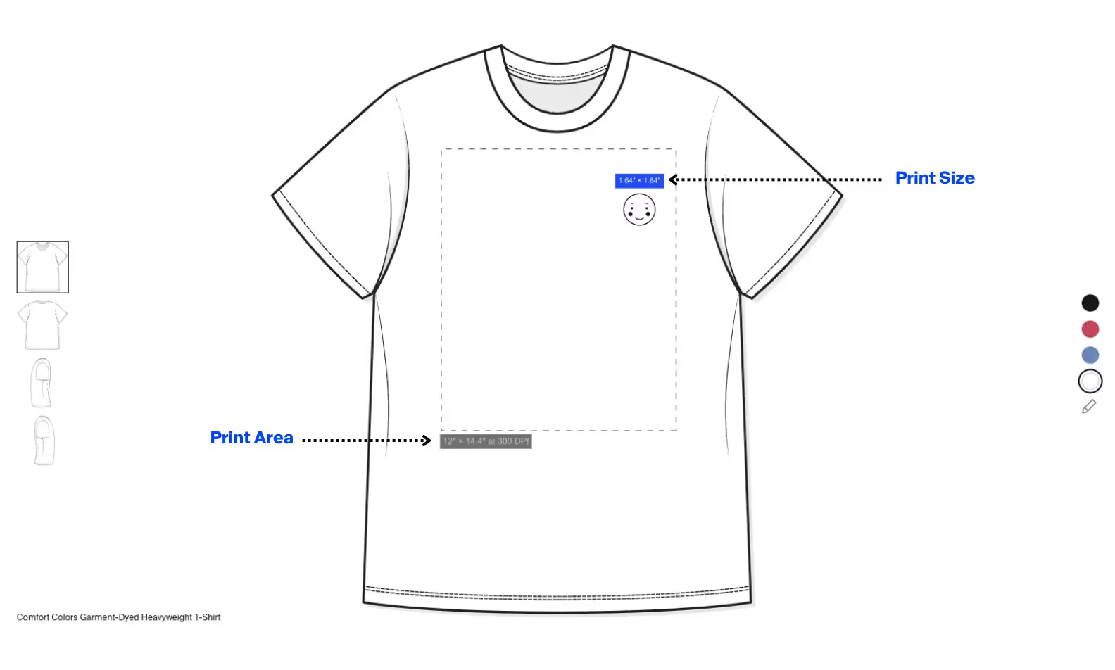
Print Size vs. Print Area
Print size is how large your logo or design will appear on the shirt—measured in inches or centimeters. Print area refers to the maximum space a printer can physically print on that part of the garment.
For example, your printer may allow a 12x16 inch print area on the shirt front, but your logo might only need to be 9x9 inches. Always clarify the difference before sending files. If your design goes past the allowed print area, it might get cropped or shrunk, so design accordingly. Ask for a print area template from your printer if you’re unsure.
Logo Placement on Shirt Sizing Guides and Tips
Here are some sizing and placement tips:
Adult Size Guides
When you’re setting up logo placement on shirt for adults, proportions matter. Standard placements like left chest or center chest have “sweet spots” that look balanced across most adult shirt sizes. For left chest, place your logo three to four inches from the collar and four to five inches from the center. For full chest, aim for four inches below the collar, centered.
Oversized designs should fit within a 12x16 inch print area, but consider the size of the shirt: what works on an XL may overwhelm a small. If you print for unisex or men’s cuts, those measurements usually apply across the board. Always test print or use a template to check your spacing.
Youth & Toddler Guides
Children’s shirts are smaller, so logo placement on shirt needs to be scaled down. Place chest logos two to three inches from the collar, and shrink the artwork to fit a print area of about 7x9 inches for youth, even smaller for toddlers. The goal is to keep the logo centered and not too close to seams or edges.
Sleeve prints on kids’ shirts should be about 1.5 to 2.5 inches wide. For little ones, err on the side of smaller designs—large prints can feel uncomfortable and look overwhelming on tiny shirts. Use a ruler or template for the best results.
Placement Tools & Rulers
You can make logo placement on shirt much easier with the right tools. Clear plastic rulers, alignment guides, and placement templates help you line up designs perfectly every time. Many print shops use specialized T-shirt rulers or laser guides for precision.
If you print at home or mock up designs, printable templates are your best friend. You’ll find free resources online or you can invest in reusable guides for frequent projects. Marking your shirt with tailor’s chalk or removable tape helps keep everything straight, so your logo lands exactly where you want it.
Design Tips: How to Make Your Logo Stand Out
Getting noticed isn’t just about where you place your logo—it’s about making smart design choices that draw the right kind of attention. Here are tips for making any logo placement on shirt shine:
- Keep it simple: Clean, bold shapes and minimal text read well at a distance. Busy or complex designs lose clarity, especially on smaller placements like the left chest or sleeve.
- Contrast counts: Choose colors that pop against your shirt fabric. High-contrast logos are easier to see and more memorable.
- Mind the scale: Your logo shouldn’t overwhelm the shirt or get lost in negative space. Test different sizes on print previews, or print out at full scale and tape to a shirt to judge the look.
- Think about context: Will people see the logo at an event, from a stage, or up close? Adjust your size and placement to fit the scenario. For events, bigger and bolder often works best.
- Balance your branding: You can combine placements, like a chest logo with a sleeve print or a small front logo paired with a bold back design. Just don’t overdo it—two placements usually feel polished, while more can look busy.
- Don’t forget comfort: Large, dense prints can make shirts feel stiff or less breathable. Use lighter inks or break up the design when you can.
Common Mistakes to Avoid
Placing a logo on a shirt seems simple, but even the pros slip up from time to time. To keep your project on track, watch out for these classic mistakes:
- Ignoring shirt size differences: What looks centered on a medium may be off-balance on a small or XXL. Always adjust your placement for each shirt size or use scalable templates.
- Low-resolution artwork: Nothing ruins a great logo placement on shirt faster than a blurry or pixelated print. Start with crisp, high-res files and vector graphics whenever possible.
- Placing logos too close to seams: Designs near collars, armpits, or hems can get distorted when the shirt moves or stretches. Stick to the recommended distances for best results.
- Overcrowding with too many placements: More isn’t always better. One or two well-chosen spots look professional; more than that can feel messy or confusing.
- Skipping test prints: It’s tempting to go straight to production, but a single sample reveals design or placement problems before you print a hundred shirts.
Conclusion
Choosing the right logo placement on shirt makes a huge difference in how your shirts look, feel, and represent your brand. From classic chest logos to creative sleeve and back placements, the options let you show off your style or business in just the right way. Pay attention to sizing, artwork quality, and placement details—these choices keep your shirts looking sharp and professional. When in doubt, order a test print or sample. With thoughtful planning and a little creativity, your shirts will always make the right impression, wherever they’re worn.
Start your dropshipping business today
Logo Placement on Shirt FAQs
What is the best logo placement on shirt for a professional look?
For a professional appearance, the left chest placement is a tried-and-true choice. It’s subtle, trusted by many brands, and keeps your branding visible without being overwhelming. This spot works well for uniforms, corporate shirts, and team apparel. Left chest logos also pair well with secondary placements, like a sleeve or back print, if you want more branding.
How big should a logo be on a shirt?
Logo size depends on its placement. Left chest logos usually range from 2.5 to 5 inches wide, while full front designs can be up to 12 inches wide. Always consider the shirt size and the amount of detail in your design. Test your logo at full scale on a shirt before printing to see what feels balanced and readable.
Can I place my logo anywhere on a shirt?
You can put your logo almost anywhere, but some spots work better than others. Standard areas include the left chest, center front, back, sleeves, and above pockets. Always check with your printer about placement limits, as some spots may be harder to print or embroider. Creative placements are fun, but make sure they’re comfortable and visible.
What file format should my logo be for shirt printing?
Vector formats like AI, SVG, or EPS are best for shirt printing, since they scale without losing quality. High-resolution PNGs with a transparent background also work well, especially for full-color or digital prints. Avoid using low-res images, screenshots, or heavily compressed JPEGs—these can cause blurry or pixelated prints that ruin your final product.


Launch your dropshipping business now!
Start free trial.avif)


Related blogs

AI A/B Testing for Landing Pages
Learn A/B testing for landing pages with AI tools. Improve conversions, test faster, and optimize performance with smart data-driven experiments.


2026 Podcast Monetization Playbook: Best Podcasting Platforms that Make You Money
Find the best podcast platform for monetization in 2026. See which hosts offer the highest payouts and lowest fees for your show.


Top 10 Valentine Gifts for Girlfriend
Looking for the perfect Valentine gift for your girlfriend? Discover the top 10 romantic, thoughtful, and trending Valentine gifts she'll love.