15 Typography T Shirt Design Ideas That Actually Sell
Discover 15 high-converting typography t shirt design ideas with styling tips, layout strategies, and selling advice to grow your apparel business.

.avif)

Typography is one of the most powerful tools in apparel design. While graphic-heavy prints and illustrations trend in cycles, text-based shirts consistently remain profitable. Why? Because words carry identity. They express personality, values, humor, ambition, and emotion — all without complex artwork.
If you’re searching for profitable typography t shirt design ideas, this guide goes beyond inspiration. You’ll find 15 strong design directions, why they work, how to style them, layout principles, font strategies, and detailed selling advice to help you build a high-performing apparel collection.
Typography tees are not just about text. They are about clarity, psychology, and positioning.
Let’s break down how to use typography strategically — and which ideas convert best.
Why Typography T Shirts Perform So Well in Ecommerce?
Typography t shirts perform exceptionally well in ecommerce because they combine simplicity with strong emotional impact. Unlike complex graphic designs, typography relies on clear messaging that customers can instantly relate to. When someone reads a phrase that reflects their personality, beliefs, humor, or ambition, the connection happens immediately — and that emotional alignment often drives faster purchase decisions.
From a business perspective, typography tees are also easier to design, test, and scale. They require fewer production variables, adapt easily to different niches, and allow brands to experiment with new messaging without redesigning entire collections. This flexibility makes them ideal for trend-based launches, seasonal drops, and niche targeting.
Before diving into the designs, it’s important to understand why typography-based apparel works so well.
1. Identity-Driven Purchases
People buy typography shirts because they relate to the message. When someone reads a phrase and thinks, “That’s exactly how I feel,” the buying decision becomes emotional rather than logical.
Unlike purely decorative designs, typography connects directly to personality.
2. Low Production Complexity
Typography designs require fewer elements. That means:
- Faster design creation
- Lower revision time
- Easier scaling
- More room for A/B testing
This makes typography ideal for dropshipping and print-on-demand models.
3. Broad Niche Adaptability
Typography can serve:
- Fitness brands
- Entrepreneur communities
- Travel lovers
- Minimalist fashion
- Streetwear culture
- Seasonal campaigns
Few design formats are this flexible.
4. Strong Social Media Performance
Text-based shirts perform exceptionally well in:
- Outfit reels
- Street photography
- Lifestyle shoots
- Relatable humor posts
Clear text translates well even on small screens.
Now let’s explore 15 typography t-shirt design ideas in depth.
15 High-Converting Typography T-Shirt Design Ideas You Can Start Using Today
Typography remains one of the most versatile and profitable approaches in apparel design. Whether your brand leans toward minimal fashion, bold streetwear, motivational fitness, or seasonal collections, text-based designs allow you to communicate identity clearly and powerfully.
The following typography t-shirt design ideas are grouped by style and intent — from one-word statements to badge-style layouts. Each concept is built around strong messaging, emotional connection, and practical design execution, making them ideal for ecommerce brands looking to create products that resonate and convert.
1. Minimal One-Word Power Statements
Examples:
- Unstoppable
- Limitless
- Focus
- Elevate
- Fearless
These designs rely on simplicity and impact. A single strong word creates authority and confidence.
Why they sell: Short words are bold and versatile. They work across genders and age groups. They’re easy to style and ideal for fitness, entrepreneur, and lifestyle markets.
Design guidance: Use bold sans-serif fonts. Keep spacing generous. Avoid over-styling. Let the word dominate.
Placement tip: Center chest or oversized print works best for impact.
2. Motivational Growth Phrases
Examples:
- Progress Over Perfection
- Built Different
- Mindset Is Everything
- Keep Moving Forward
- Earned Not Given
Motivational typography remains evergreen. These phrases appeal to people pursuing growth — in business, fitness, or personal development.
Why they sell: They tap into aspiration. People like wearing reminders of who they want to become.
Design guidance: Use hierarchy. Highlight one key word in bold while keeping the rest lighter. Avoid clutter.
3. Clean Minimalist Typography
Examples:
- Simplify
- Stay Present
- Quiet Confidence
- Just Breathe
Minimalism communicates sophistication.
Why they sell: Minimal designs feel premium. They appeal to customers who prefer subtle fashion over loud graphics.
Design guidance: Use thin or medium-weight fonts. Small chest placement works well. Keep the color palette neutral.
4. Retro Curved Typography
Examples:
- Good Vibes Only
- Weekend Energy
- Classic Spirit
- Vintage Soul
Retro typography evokes nostalgia.
Why they sell: Nostalgia triggers emotion. Vintage-style curved text layouts feel warm and familiar.
Design guidance: Use slightly distressed textures and soft color palettes. Curved text arcs add authenticity.
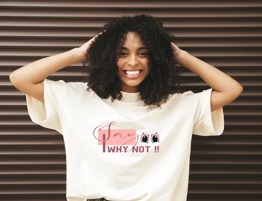
5. Script Handwritten Quotes
Examples:
- Stay Wild
- Dream Big
- Create Your Magic
- Live Free
Script fonts feel personal and expressive.
Why they sell: They connect emotionally, especially in boutique and lifestyle markets.
Design guidance: Ensure readability. Overly decorative script reduces clarity. Balance elegance with structure.
6. Bold Streetwear Typography
Examples:
- No Rules
- System Broken
- Own Your Power
- Zero Limits
Streetwear thrives on attitude.
Why they sell: Youth culture responds to bold messaging. Typography-heavy streetwear designs are strong performers.
Design guidance: Use heavy fonts. Experiment with stacking and asymmetry.
7. Humor-Based Typography
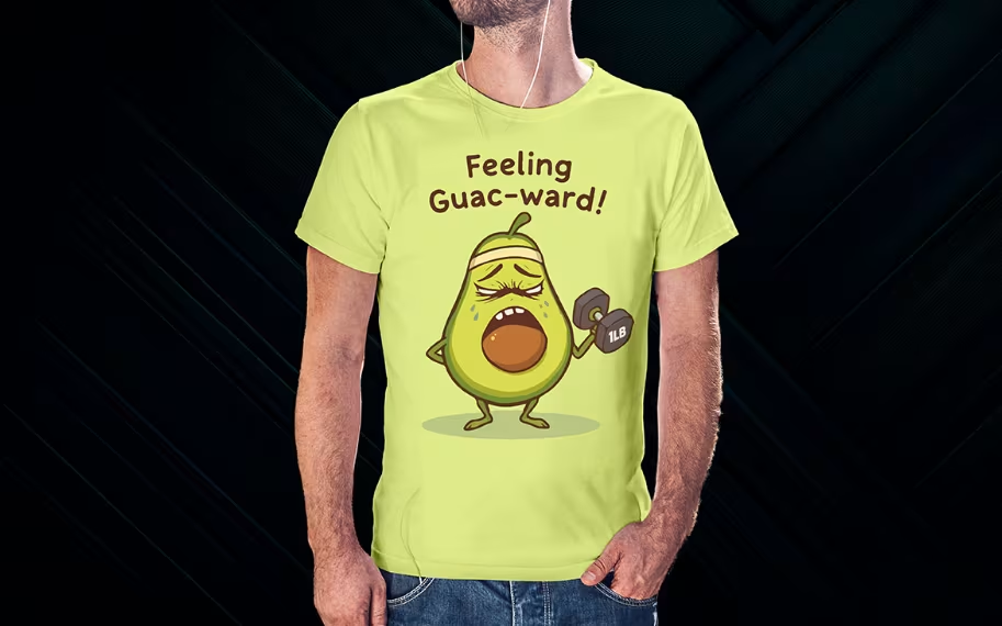
Examples:
- Powered by Coffee
- Introverting
- Out of Office
- Sarcasm Loading
Humor reduces buying resistance.
Why they sell: Funny shirts make great gifts and impulse buys.
Design guidance: Keep jokes short. Simplicity increases impact.
8. Fitness & Athletic Slogans
Examples:
- Train Hard
- One More Rep
- Stronger Every Day
- Sweat Equity
Fitness apparel buyers identify with motivational messaging.
Why they sell: Gym communities value mindset-driven apparel.
Design guidance: Use bold athletic fonts and high-contrast layouts.
9. Travel & Adventure Typography
Examples:
- Adventure Awaits
- Wander Often
- Explore More
- Road Trip Ready
Travel themes work year-round.
Why they sell: People associate travel with freedom and excitement.
Design guidance: Pair text with minimal line elements if needed. Keep typography dominant.
10. Value-Driven Statement Tees
Examples:
- Kindness Wins
- Be the Change
- Equality Always
- Love Is Love
Purpose-driven messaging resonates strongly.
Why they sell: Buyers align purchases with identity and beliefs.
Design guidance: Keep layout simple. The message should be instantly readable.
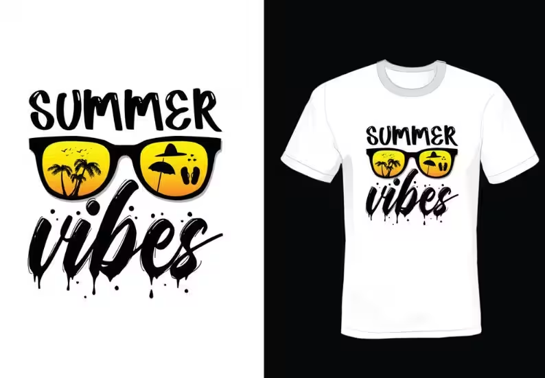
11. Seasonal Typography
Examples:
- Spring Vibes
- Summer State of Mind
- Holiday Mode
- Fall Energy
Seasonal drops create urgency.
Why they sell: They align with shopping intent during specific times of year.
Design guidance: Adjust font personality to match seasonal mood.
12. Typographic Layout Art
Examples:
- Vertical stacked words
- Circular typography
- Split alignment phrases
- Broken baseline styles
Layout becomes the design.
Why they sell: Creative typography feels artistic without graphics.
Design guidance: Test alignment variations. Maintain readability.
13. Badge-Style Typography
Examples:
- Established 2024
- Premium Quality
- Authentic Since Day One
Badge layouts feel official.
Why they sell: They mimic heritage branding.
Design guidance: Use borders or emblem shapes to structure text.
14. Micro Typography Chest Prints
Examples:
- Stay True
- Daily Discipline
- Always Moving
Subtle is powerful.
Why they sell: Minimal prints appeal to understated fashion buyers.
Design guidance: Keep designs small and precise.
15. Customizable Typography Designs
Examples:
- Custom Name + Year
- City Pride
- Team Slogan
- Graduation Year
Personalization increases perceived value.
Why they sell: Customers love products that feel unique.
Design guidance: Ensure adaptable font sizing for various name lengths.
How to Design Typography T Shirts That Convert
Strong typography is never accidental. The difference between a shirt that looks “nice” and one that actually sells often comes down to structure, clarity, and visual balance. When designing typography t-shirts, you’re not just choosing words — you’re designing how those words feel, flow, and command attention.
Here’s how to approach typography strategically so your designs convert, not just decorate.
1. Focus on Font Pairing
Font pairing is one of the most important decisions in typography design. The right combination creates contrast and balance. The wrong combination creates confusion.
Effective font pairing follows structure, not randomness.
Bold headline + clean secondary font
If your design includes two lines of text, use a bold, heavy font for the main phrase and a lighter, simpler font for supporting text. This creates emphasis and ensures the core message stands out.
Serif + sans-serif contrast
Serif fonts feel classic and timeless, while sans-serif fonts feel modern and clean. Pairing them creates visual interest without overwhelming the design.
Script + minimalist support font
Script fonts feel expressive and emotional. However, they can be hard to read if overused. Balance them with a clean sans-serif subtext to maintain clarity.
The key rule: Avoid mixing too many styles. Using three or four different font personalities on one shirt weakens cohesion and reduces perceived quality. Stick to one primary font and one supporting font whenever possible.
2. Create Visual Hierarchy
Not every word on your shirt should have equal visual weight.
Hierarchy guides the viewer’s eye and determines what they read first, second, and third. Without hierarchy, text looks flat and chaotic.
You can create hierarchy through:
- Size differences
- Font weight variations
- Color contrast
- Spacing adjustments
For example, in the phrase “Progress Over Perfection,” you might bold “Progress” and lighten the rest. This immediately draws attention to the key word while keeping the phrase intact.
Hierarchy increases clarity, and clarity increases conversions.
3. Prioritize Readability
If customers cannot read the design instantly, they won’t buy it. Typography must be legible from a distance. Remember that most people first see your shirt in:
- Social media feeds
- Product thumbnails
- Mobile screens
Overly decorative fonts may look beautiful up close but fail in real-world viewing conditions.
Ask yourself:
- Can this be read clearly from 3–6 feet away?
- Does the spacing make letters blend together?
- Is the contrast strong enough between text and fabric color?
Readability is not a design compromise — it is a selling advantage.
4. Use Proper Spacing
Spacing is often overlooked, but it dramatically affects professionalism. There are three key spacing elements:
- Kerning – The spacing between individual letters. Poor kerning makes words look uneven or amateur.
- Tracking – The overall spacing across a word. Increasing tracking slightly can give designs a premium, modern feel.
- Line spacing (leading) – The vertical space between lines of text. Too tight feels cramped. Too loose feels disconnected.
Good spacing creates breathing room. It makes your typography feel intentional and polished rather than rushed.
5. Think About Placement Strategy
Typography placement affects perception and style.
- Center chest feels bold and traditional.
- Oversized print feels trendy and streetwear-inspired.
- Left chest minimal text feels subtle and premium.
- Vertical alignment feels modern and artistic.
Test different placements to see which aligns best with your target audience.
6. Match Typography Style to Audience
Typography isn’t just about aesthetics — it communicates tone.
- Bold, block fonts signal confidence and strength.
- Thin minimalist fonts signal elegance and restraint.
- Script fonts signal emotion and creativity.
- Distressed fonts signal nostalgia and vintage appeal.
Always design with your customer persona in mind.
7. Keep It Emotionally Clear
Beyond fonts and spacing, your message should be instantly understandable.
Short phrases convert better than long paragraphs. Direct statements outperform vague wording. Clear emotion sells more than clever complexity.
A shirt that says “Fearless” is easier to process than one that uses a long poetic line.
Pricing Strategy for Typography Tees
Typography shirts can be positioned at different price tiers.
- Entry-Level: Simple one-word or short-phrase designs.
- Mid-Tier: Creative layouts or niche-specific messaging.
- Premium: High-quality fabric + strong brand identity + minimalist placement.
Perceived value often depends more on presentation than complexity.
Marketing Typography T Shirts Effectively
Marketing typography t shirts is less about the fabric and more about the message. Since text-based designs rely on emotional connection, your marketing should amplify meaning, not just visuals.
Use Lifestyle Photography
Show real people wearing the shirt in everyday, relatable situations — at a coffee shop, working out, traveling, or relaxing at home. This helps customers imagine themselves in the product. Clean studio mockups are useful, but lifestyle images create emotional context and increase engagement on social media.
Highlight the Meaning
Don’t just repeat the phrase in your caption — explain what it stands for. If the shirt says “Progress Over Perfection,” talk about growth, discipline, or resilience. When customers understand the deeper message, the product feels intentional rather than decorative.
Encourage Community Interaction
Typography builds identity. Invite customers to share how they connect with the phrase.
- Ask questions in captions
- Repost user-generated content
- Create hashtag campaigns
When people feel part of a shared mindset, they’re more likely to buy — and advocate for — your brand.
Final Thoughts
Typography t-shirt design ideas are not just trends. They are one of the most adaptable, scalable, and profitable design approaches in apparel.
The secret is clarity, not complexity. The right phrase, paired with thoughtful typography and smart positioning, can outperform highly detailed graphics.
If you focus on identity-driven messaging, readable layouts, and strategic branding, typography tees can become the foundation of a successful apparel line. Words are powerful. When placed intentionally, they sell.
Ready to turn these typography designs into real products without the sourcing headache? Start building your t-shirt collection with Spocket — explore reliable suppliers, choose products that match your brand vibe, and launch faster with smoother fulfillment.
Start your dropshipping business today
FAQs About Typography T-Shirt Design Ideas
What makes typography t-shirt design ideas profitable?
Typography t-shirt design ideas are profitable because they combine low production complexity with strong emotional appeal. Text-based designs are easier to create, faster to test, and adaptable across multiple niches like fitness, streetwear, minimal fashion, and seasonal drops. When a phrase resonates with identity or mindset, conversions increase significantly.
Which fonts work best for typography t-shirts?
Bold sans-serif fonts work well for powerful statements, script fonts suit lifestyle or boutique brands, and serif fonts are ideal for vintage-inspired designs. The key is readability. Choose fonts that are clear from a distance and avoid overly decorative styles that reduce legibility.
How long should a typography t-shirt phrase be?
Short phrases typically perform better because they’re easier to read and remember. One to five words is ideal for strong impact. Longer quotes can work, but they require proper visual hierarchy and spacing to maintain clarity.
Are minimalist typography t-shirts trending?
Yes. Minimalist typography continues to perform strongly, especially among modern and premium fashion audiences. Small chest prints and clean layouts often feel more elevated and wearable than oversized or overly complex designs.
How can I test typography t-shirt design ideas before launching?
You can validate ideas by running small ad tests, posting mockups on social media, conducting audience polls, or launching limited drops. Testing different phrases, font styles, and placements helps identify which messaging resonates most with your target market.


Launch your dropshipping business now!
Start free trial


Related blogs
How to Use Facebook Pixel to Build Smarter Ads for Your Dropshipping Store
Learn how Meta Pixel turns store activity into clearer ad insights so you can retarget shoppers, improve campaigns, and scale dropshipping products with confidence.


How to Validate a Dropshipping Product Idea Before You Spend a Dollar on Ads
Learn how to validate a dropshipping product idea before ads using demand checks, competitor research, supplier data, and a simple validation checklist.


How to Build an Email Newsletter for Your Dropshipping Brand (From 0 to 10K Subs)?
Learn how to build an email list for your dropshipping store and scale to 10,000 subscribers using lead magnets, popups, segmentation, and high-converting campaigns.