


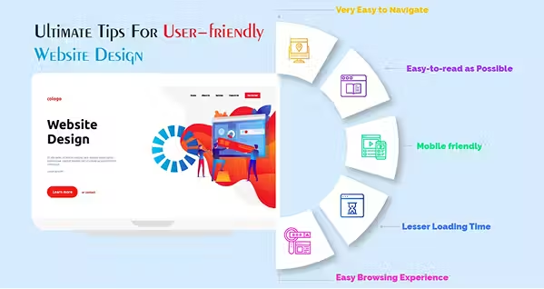
Web Design Tips You Just Can't Ignore!
Here are some web design tips you just can’t ignore. If you’re building a website or getting serious about your business, you can’t miss them!


Bad design can kill a good idea faster than bad code. You can have the most brilliant product, the sharpest marketing copy, and the perfect SEO setup — but if the site looks sloppy or feels frustrating to use, people will bounce without a second thought.
Good design isn’t about stuffing the page with fancy effects or chasing the latest trends. It’s about making the experience clear, fast, and pleasant for the people using it. That means pages that load in seconds, layouts that make sense without a manual, and visuals that actually match what the site is about.
This guide skips the fluff and gets into practical, real-world tips that work whether you’re building from scratch or fixing an existing site. We’ll talk about keeping navigation brain-dead simple, writing text that people actually want to read, picking colors without starting a migraine, and plenty more.
Think of it as a toolkit you can use right away — because great design isn’t magic. It’s just the result of following a handful of smart, consistent rules that make life easier for your users. Let’s check out some of the best web design tips and practices below.
Best Web Design Tips in 2025
These will help you on your journey. Try some of these top web design tips and you’ll notice great results flowing in soon:
Start With Your Users, Not Your Ego
Your site isn’t for you. It’s for the people using it. That sounds obvious, but a lot of designs fail because they’re built around what the creator thinks looks good, not what actually works for the audience.
First, figure out what your users are trying to do. Are they here to buy something? Book an appointment? Learn a skill? If you don’t know their end goal, you’re just guessing. Write down 2–3 primary actions you want people to take, then make sure your design helps them do those things with as little friction as possible. It helps to create quick buyer personas — not a 10-page marketing report, just a simple profile of your typical user: their main need, a few behaviors, and what might frustrate them. This keeps you from designing for “everyone” (which basically means no one).
From day one, bake in accessibility. That means proper color contrast, readable font sizes, keyboard-friendly navigation, and descriptive alt text for images. Accessibility isn’t “extra credit” — it’s core usability.
And don’t do it all in isolation. Loop in perspectives from devs, SEO specialists, marketing, and customer service. Each group sees things you’ll miss. Even better, get early feedback from real users — not just friends who’ll tell you it’s fine to be nice. The earlier you find out something’s confusing, the easier it is to fix. The earlier you find out something’s confusing, the easier it is to fix. In many cases, working with an experienced web development agency often helps bring those perspectives together early, before small usability gaps turn into costly rebuilds. The more you design with actual people in mind, the fewer “what were they thinking?” moments you’ll have later.
Keep the Homepage Clean and Punchy
Your homepage is prime real estate. It’s the front door, the lobby, and the elevator pitch all rolled into one. If visitors can’t figure out what you do in the first five seconds, they’re not sticking around for six. Keep it minimal. That doesn’t mean empty — it means intentional. Every element should earn its spot. Cut anything that doesn’t help someone understand what you offer or move them toward their goal. Clutter makes users work harder, and they won’t thank you for it.
Put the essentials above the fold — the part of the screen visible without scrolling. Usually that means a clear headline, a short value statement, and one main call-to-action (CTA). Anything less important can go lower, but make sure the most critical stuff is front and center. Don’t underestimate whitespace. It’s not “empty”; it’s breathing room that makes important content pop. Without it, even the best images and copy get lost in the noise.
Make Navigation Stupid-Simple

If people can’t find what they’re looking for, they’re gone. It doesn’t matter how beautiful your site is — clumsy navigation is like giving someone a gorgeous house with no doors. Stick to predictable menus. Your navigation bar should be where people expect it (top or left side) and should use standard labels: “About,” “Services,” “Contact,” not “Our Story” or “Let’s Talk” unless your audience genuinely clicks with that.
Always link your logo to the homepage. It’s muscle memory for most users. Add a search bar — yes, even if you think your site is simple. Footers should have extra navigation links and important stuff like contact info or policies. Breadcrumbs are useful for keeping track of where you are, especially on big sites.
Avoid “clever” design tricks that break usability. Hidden menus, weird icon-only navigation, or hijacked scrolling might look cool in your head, but in practice they frustrate users. The goal: a first-time visitor should know exactly where to click without thinking. If they need a tutorial to use your site, you’ve already lost.
Use Visual Hierarchy Like a Map
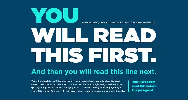
Your design should guide people’s eyes the way a good map guides someone’s steps. Without it, users wander, miss important stuff, and maybe never see that perfect call-to-action you buried in the middle of the page. Start with size and weight. Bigger, bolder text grabs attention first, so make your main headline the largest thing on the screen. Secondary text can be smaller and lighter.
Then there’s color contrast. Bright colors stand out against muted ones, and high contrast draws the eye faster than subtle shading. That’s why your “Buy Now” button shouldn’t be the same color as your background. Use positioning to your advantage. People scan in predictable patterns — often an “F” or “Z” shape. Put your most important elements along those natural eye paths.
Don’t be afraid of asymmetry. Breaking the pattern strategically can highlight something important. For example, if everything’s in neat columns, one offset image or bold block of text will grab extra attention.
Make Text Easy to Read (Seriously)
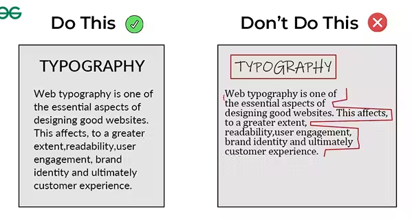
If your text is hard to read, nothing else matters. People won’t squint or zoom in just to figure out what you’re saying — they’ll just leave. Start with contrast. Dark text on a light background (or the reverse) is the safest bet. Avoid low-contrast combos like gray-on-light-gray unless you want your content to disappear.
Font size matters more than you think. For body text, 16px is the absolute floor. Go larger if your audience skews older or if your design has lots of whitespace. Limit yourself to three font families at most — one for headings, one for body copy, maybe one accent font if it fits your brand. Keep sizes and weights consistent so your design feels intentional, not random.
Use hierarchy in your copy. Big, bold headings break up walls of text and give scanners an easy way to find what matters. Subheadings help organize thoughts, and bullet points make lists digestible. And remember: people skim. Write and format your text so they can get the gist in seconds, but keep enough substance for those who want to dig deeper.
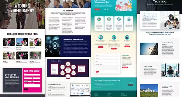
Use Images That Don’t Suck

A great image can make your site feel polished and professional. A bad one can make it look like it hasn’t been updated since 2008. Skip the obvious stock photos — you know, the ones with way-too-happy people shaking hands in perfect lighting. They’re overused, and visitors can spot them a mile away. Instead, go for authentic, high-quality visuals. If you can’t take your own, use stock sites with fresher, less cliché options (Unsplash, Pexels, etc.).
Make sure every image is responsive — it should scale down gracefully on mobile without cutting off key parts. Compress files so they don’t tank your load time. You can shrink file sizes without making them look bad. Don’t skip alt text. It’s not just for accessibility (though that’s reason enough) — it also helps search engines understand your content.
Animations and videos can add life, but keep them light. If your home page takes forever to load because of a giant autoplay video, you’re losing people before they see a single frame. Bottom line: every image should serve a purpose, not just fill space.
Keep Branding Tight
Branding isn’t just your logo — it’s the entire vibe of your site. If one page looks sleek and modern while another feels like it was built in 2013, people notice. And not in a good way. First, consistency is king. Fonts, colors, button styles, spacing — they should look and feel the same across the whole site. That way, users always know they’re still in your world, no matter what page they’re on.
Stick to the 3–4 color rule. Too many colors make a site feel chaotic, like every section is yelling for attention. Choose a primary color, a secondary, and maybe one or two accents. Apply them with purpose: primary for main actions, secondary for highlights, accents for small pops.
Match your style to your audience’s expectations. A site for a corporate law firm shouldn’t feel like a comic book store, and a gaming site shouldn’t look like a bank’s homepage. Think tone, mood, and industry norms — then find ways to make it uniquely yours. When your branding is tight, it’s not just pretty — it’s trust-building. People start to feel like they “know” your site, which keeps them coming back.
Think Mobile-First
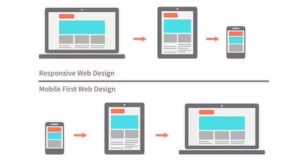
More people browse the web on their phones than on desktops, so if your site only looks good on a big screen, you’re already losing half your audience. Designing mobile-first flips the old approach — you start with the smallest screen and scale up.
On mobile, space is precious. Ditch anything that isn’t essential. Keep layouts simple, text readable, and buttons big enough to tap without zooming. A good rule: if someone has to pinch and zoom to use your site, it’s broken. Menus should collapse neatly into a hamburger or tab bar. Forms should be short and easy to fill out with thumbs. And watch out for elements that overlap or get cut off on small screens.
Once the mobile version works, scaling up to tablet and desktop is way easier. You can add enhancements — bigger images, more columns — without breaking the experience for smaller devices. And always test on real devices, not just your browser’s “mobile preview.” What looks fine in a simulation can feel totally different in someone’s hand.
Keep It Fast and Light
Nobody’s waiting around for a slow site. Every extra second your page takes to load is another chunk of visitors bouncing off to a competitor. Start by optimizing your assets. Compress images without making them look fuzzy. Use tools like TinyPNG, ImageOptim, or Squoosh to shrink file sizes. For videos, consider hosting them on YouTube or Vimeo instead of clogging your server.
Minify your CSS and JavaScript so your browser has less to process. If you’re not doing this automatically, most build tools (or even WordPress plugins) can handle it for you. Also, ditch unused code — bloated CSS frameworks or leftover scripts slow everything down. If you want a quick path to a lightweight, consistent design, try a CSS framework like Bootstrap or Tailwind. They’re battle-tested, mobile-ready, and will save you from reinventing the wheel.
Finally, test your speed. Use Google PageSpeed Insights or GTmetrix to see where you’re lagging, then fix the biggest offenders first. Even small improvements can make your site feel dramatically snappier. The rule here’s simple: the lighter the site, the happier the user.
Test, Learn, Repeat

A good design isn’t a one-and-done job — it’s a work in progress. The only way to know if something works is to watch real people use it. Start with heatmaps to see where users click, scroll, and hover. If nobody’s clicking your main button, maybe it’s in the wrong place or looks like a decoration.
Session recordings are like peeking over someone’s shoulder. You’ll spot where they get stuck, backtrack, or rage-click. It’s not about spying — it’s about spotting friction points you can fix. Check your analytics regularly. Are people bouncing after one page? Dropping off halfway through a form? That’s your cue to tweak.
Make small, controlled changes instead of blowing up the whole site. Test different headlines, button colors, or layouts one at a time so you know what actually made a difference. And don’t be shy about borrowing ideas. Look at sites you like and reverse-engineer why they work. Copy the principles, not the exact design, and adapt them to your brand.
Conclusion
Great web design isn’t about cramming in every feature or making everything flash and spin. It’s about making your site work for your users — fast, clear, and easy to use. If you nail the basics — simple navigation, readable text, clear visuals, tight branding, mobile-first layouts, and quick load times — you’ve already beaten a huge chunk of the internet. The rest is just fine-tuning.
And that fine-tuning never really stops. Trends change, tech changes, and your audience’s expectations shift over time. The sites that win are the ones that keep learning, testing, and improving.
So start small. Fix the things that make the biggest difference for your visitors. Then keep going, one improvement at a time. Before you know it, you’ll have a site that doesn’t just look good — it works hard for everyone who visits.
Start your dropshipping business today
Web Design Tips FAQs
What’s the most important thing to focus on in web design?
The most important thing is designing for your users, not just your own taste. Understand who they are, what they want, and how they browse. A clear, fast, and accessible site always beats a flashy but confusing one. Prioritize usability first, then layer in your visual style so it supports, not distracts from, their goals.
How can I make my website load faster without losing quality?
Speed comes from smart optimization. Compress images using tools like TinyPNG or Squoosh, minify CSS and JavaScript, and remove unused code. Host heavy media externally when possible. Even shaving off a second improves user experience and SEO rankings. Test regularly with Google PageSpeed Insights and fix the biggest slowdowns first for maximum impact.
Do I need a mobile-first design for my website?
Yes — more than half of all browsing happens on mobile. Starting with a mobile-first design forces you to simplify layouts, make buttons easy to tap, and keep navigation clear. Once it works beautifully on a small screen, you can scale it up for the desktop. This approach improves usability and keeps Google happy for SEO.
How often should I update my website design?
There’s no fixed timeline, but you should review your design at least once a year. Look at analytics, heatmaps, and user feedback to see what’s working and what’s not. Small updates — like improving navigation, refreshing images, or tweaking CTAs — can keep the site feeling fresh without a full redesign. Continuous improvement beats massive overhauls every time.


Launch your dropshipping business now!
Start free trial.avif)


Related blogs

AI A/B Testing for Landing Pages
Learn A/B testing for landing pages with AI tools. Improve conversions, test faster, and optimize performance with smart data-driven experiments.


2026 Podcast Monetization Playbook: Best Podcasting Platforms that Make You Money
Find the best podcast platform for monetization in 2026. See which hosts offer the highest payouts and lowest fees for your show.


Top 10 Valentine Gifts for Girlfriend
Looking for the perfect Valentine gift for your girlfriend? Discover the top 10 romantic, thoughtful, and trending Valentine gifts she'll love.